peoplesmemorial.org
What is actually on the site, why it feels crowded, how it should be reorganised, and what to fix first.
The short version: the site is not too big. It is too wide. There are about 153 real pages. The menu offers 82 places to go, on every one of them. Almost nothing on the site links to anything else, so the menu carries the whole load. The writing itself is good and honest. It is in the wrong order. The most convincing facts sit near the bottom of long pages, and the page a grieving family needs is filed inside the Member Hub dropdown — one member service among ten.
Nothing in this report is a criticism of the writing or of the people who did it. Every fact that would make a stranger join is already on this site. It is just hard to get to. The facts sit near the bottom of long pages. The pages take a minute to load. The menu is arranged by which department owns a page, not by what anyone came for. Two people pay for that every day: the one who needed the 24-hour number and never found it, and the one who would have paid $99 and was never told the price.
1The reorganisation
The recommendation comes first, because it is the thing worth doing. Everything after it is either the evidence for it or a fix that can be made before it starts.
The site is currently organised by who inside PMA owns the page — Member Hub, Education, Community Support, Advocacy, About. A visitor does not know or care which department owns anything. Nearly everyone who arrives is in one of four situations, and the site should be organised around those.
- Someone has died, or is dying. They need a phone number, they need to know what happens in the next twelve hours, and they need to know PMA is not itself a funeral home. This is the least forgiving situation on the site, and the worst served. The page for it sits inside the Member Hub menu. The 24-hour number appears on 2 pages out of 181.
- They are planning ahead — for themselves or a parent. They want to know the options, what each costs, and what to sign. Today this material is split across three separate sections (Education, Member Hub › Planning Documents, and Planning Information), so the same question is answered in three places and started in none. The closest thing to a starting point is a workshop page filed under Education.
- They are deciding whether to join, or they already have. What does $99 buy, which funeral homes honour it, and — if they are already a member — where are the forms and how do they update their address. This is the best-served audience already: the join page is one of the handful of pages the writing actually points at — 17 links from 11 different pages, on a site where most pages have none.
- They are here for the work, not for a funeral. Journalists, legislators, other non-profits, funeral professionals, and members who care about the price survey and the legislation. The price survey is one of the better-linked pages on the site: 12 links from 9 pages. Yet six of the nine Advocacy pages have no link into them from anyone's body text. Menu only.
These four are not a guess about visitors. They are what the site's own writing points at. Strip out the menu and the footer, and the links inside the body copy converge on five destinations: Join, Donate, the Price Survey, the Forms, and the Partner Funeral Homes list. The writing knows what the site is for. The menu does not.
A fifth category, About, holds everything that is PMA talking about itself — history, staff, the Co-op, financials, news, donate. That is a real category but it is not a situation anyone arrives in, which is why it sits last and why Donate becomes a button rather than a menu section.
The clearest symptom: "When a Death Occurs" is filed under Member Hub . It is the sixth of ten items there, between "Contracted Providers" and "Digital Document Storage Service". The page itself says PMA is not a funeral home. The person who needs it most may not be a member. It is presented as one member service among ten, on the same visual footing as "Update My Contact Information", under a heading that tells a non-member the section isn't for them. Meanwhile "Community Support" contains both support for PMA (Donate, Volunteer, Legacy Giving) and support for the visitor (Financial Assistance, Grief Support, Legal Resources). Those are opposite things under one label.
Five categories instead of five departments
| Menu label | The question it answers |
|---|---|
| A Death Has Occurred | Someone has died, or is about to. What do I do right now? |
| Plan Ahead | What are my options, what do they cost, what paperwork do I need? |
| Membership | What do I get for $99, how do I join, which funeral homes, I'm already a member. |
| Advocacy | The price survey, the legislation, filing a complaint, professional training. |
| About | Who PMA is, the Co-op, the team, news, events, financials, contact. Donate becomes a button in the header, not a menu item. |
The menu, before and after
Now
91 links to 82 destinations, on every page, three levels deep.
5 headings › 42 items › 44 sub-items. Member Hub and Education each open a second fly-out; Community Support opens 19 sub-items under 5 items.
Nine of those links are a heading repeated as its own first item ("Planning Documents › Planning Documents"). Four are dated events, including an annual meeting that happened five months ago and a 2024 conference.
Proposed
About 35 destinations, five headings, six to eight items each, one level deep.
No heading repeated as its own child. No dates in the menu — dated things get a slot on the homepage instead, which is where they belong and where they can expire.
Why 287 URLs are only 153 pages
The apparent vastness is mostly the software, not content you commissioned. Firespring generates extra URLs for the same page:
- 28 URLs are pure duplicates — the same page reachable three or four ways. Three separate donate URLs all serve the same 70-word donation box.
- 65 of the URLs are generated from seven pages. "Deathcare Professionals" generates 23, the staff page 15 (one per bio), the Speakers Bureau 12, Planning Information 6, and the blog, the events calendar and the news page another 9 between them. Each of those should be one page with sections, not twenty-three pages of 90 words each.
- Planning material is filed in three different sections at once, and prices in two. Some of these pages are word-for-word identical to each other under different URLs.
Merging those stubs back into the pages that generate them takes the site from 153 pages to 88 — without deleting a single piece of real content.
88 pages somebody wrote65 generated from lists
The last bar is the 153 real pages split where it matters: the 88 somebody sat down and wrote, and the 65 the software makes one at a time from a list.
The page count, step by step
Different parts of this report need different counts. How much there is to move is not the same question as how much there is to read. So here is the whole ladder, in one place. Every page number anywhere in this document is one of these six.
| 287 | URLs reached by the crawler, following every link on the site. 271 answered; 16 were already broken. |
| 199 | of those were pages rather than images, PDFs, stylesheets or fonts. |
| 181 | distinct URLs once redirects are followed to where they land. |
| 153 | real pages, after URLs serving word-for-word the same page are counted once. This is the number to use for "how big is the site". |
| 65 | of those 153 are generated from lists by the software — one page per staff member, per class, per speaker, per blog post, per event. |
| 88 | are pages somebody wrote. This is the number to use for anything about the writing: 33,746 words of body copy, menu and footer excluded. |
The 88 written pages are where the recommendations in this report land. The 65 generated ones disappear into their parent pages, which is why 153 becomes 88.
The part that must not be skipped
Every old URL needs a forwarding rule
The site already shows what happens when this is missed. There are 14 internal links that lead to an error page right now, and their URLs tell the story: /membership/funeral-homes/, /education-and-advocacy/education/, /partners, /memberbenefits. Those are the remains of a previous reorganisation that shipped without forwarding. One of them, /member-hub/forms.html, is linked from seven different pages and is broken on all seven.
The site also uses short URLs that people type in by hand: peoplesmemorial.org/join, /donate, /forms, /providers, /pricesurvey, /events, /newsletter, /Gift, /AnnualMeeting and nine more, eighteen in all.
These are not pages. Each one is a forwarding rule: someone types /join, and the site quietly sends them to the real URL, /member-hub/membership_application.html. They exist because the real URLs are too long to print in a newsletter or say out loud — your own price survey page prints "peoplesmemorial.org/donate" as text for a reader to type.
Sixteen of them work today. Two — /memberbenefits and /partners — are already broken, and both are still being linked from live pages. One, /FuneralAdvocacy2025, still works but now forwards to the 2026 page, so the URL in last year's printed material lands somewhere it was never meant to.
Why this matters when pages move: if the real URL changes and the forwarding rule is not updated to match, the short URL stops working. Every newsletter, business card, flyer and slide that carries it stops working with it — and paper cannot be corrected after it has been mailed. Each of these rules has to be re-pointed at its new destination as part of the move, not afterwards.
2Nothing on the site links to anything else
This is the finding behind the crowding, and it is the one that surprised me most.
Ignore the menu for a moment and look only at links inside the actual writing — the way a normal page says "here's what to read next". By that measure, 112 of the site's 181 URLs cannot be reached from the homepage at all — not in one click, and not in ten. Thirty-six pages have no incoming links from any page's text whatsoever, including the FAQ and six of the nine Advocacy pages. Thirty-nine pages are dead ends: you arrive and there is nowhere to go next.
That is why the menu has to be 82 items wide. It is the only way anything is findable, so everything gets added to it. The menu grows, which makes it harder to use, which makes people add more to it. Reorganising the menu without also linking pages to each other will not hold.
Counted another way: the header, menu and footer come to 307 words on every page, against a median of 269 words of actual content. The furniture is the same size as the writing. Underneath it, Firespring also puts the entire 1,221-word privacy policy into the footer of all 199 pages, hidden until clicked but downloaded every time — so the text shipped with an average page is 1,528 words of boilerplate wrapped around 269 words of content.
3The homepage
The homepage has no main heading, and its first screen never says what People's Memorial is. It opens with a seven-slide rotating banner. The second slide is an advertisement for an outside urn retailer. The fourth offers the annual report as an 18-megabyte download — large enough to stall on a phone.
Then the first paragraph:
Since 1939, PMA has been the thought-leader for funeral choice, education, and advocacy in Washington State.
"Thought-leader" appears on six pages. Nobody has ever joined anything because an organisation described itself as a thought-leader. The sentence also spends the site's first line on PMA, and the person reading it is the one deciding whether to stay. Here is the same information, written for them:
Now
Welcome to People's Memorial Association
Since 1939, PMA has been the thought-leader for funeral choice, education, and advocacy in Washington State. There are currently over 72,000 living members in Washington State, and we have served well over 220,000 families.
Proposed
A funeral should not cost more because you were grieving.
People's Memorial is a member-owned nonprofit. For a one-time $99, you get 15% off at more than 30 independent funeral homes across Washington, no sales pressure, and a 24-hour line your family can call. 72,000 Washingtonians are already members. Since 1939.
[ Join for $99 ] [ Someone has died ] [ Compare funeral prices ]
Every fact in that rewrite is already on your site. The three buttons cover the only three reasons anyone arrives: to plan, because someone died, or to check prices.
Underneath, replace the marketing slides with the three strongest numbers you own — which currently sit at paragraphs nine through twelve of the Member Benefits page, where almost nobody reaches them:
4The page a family needs at 2 a.m.
The 24-hour number, 888-762-2762, appears on 2 of 181 pages. On the other 179, someone whose mother died an hour ago has no way to reach a person. On the "When a Death Occurs" page itself, the number does not appear in the text until the sixth paragraph. The page is titled "PMA | Contact | Report a Death Seattle WA". There is no link to it in the header, and none on the homepage.
The site already contains the best sentence anyone has written on this subject. It is just not at the top:
Your own words
"Know that death is not an emergency."
That should be the first line of the page, and it is the sentence the whole organisation should be built around. It is sitting on the site right now, doing nothing.
Now
Reached only through Member Hub, sixth of ten, next to "Update My Contact Information". Phone number first appears in paragraph six. Ends with a 38-word sentence.
Proposed
If someone has just died
Take a breath. Death is not an emergency. You have time, and you do not have to let anyone rush you.
Need a funeral home now? Call 888-762-2762. A live person answers 24 hours a day and will connect you to the nearest PMA partner funeral home. Members save 15%. Not a member? You can join now, before you contact the funeral home, and the savings still apply.
Then: three short bullets for death at home on hospice, at home not on hospice, and in a hospital.
Note the third sentence. The fact that a family can join at the moment of need and still save money currently appears on exactly one page — the financial assistance page — and not on the page where the money is actually being spent.
5The words
The writing on this site is honest, knowledgeable and often very good. The problem is placement and posture, not talent.
The ask is phrased seventeen different ways
Counted across the whole site, the membership call to action appears as "Join Now Online", "Become a Member", "Become a PMA Member", "Become a PMA Member and save 15%", "BECOME A MEMBER NOW", "Sign up as a PMA Member", "I want to buy a membership for myself", and ten more. The donate ask has thirty-five variants of its own. Only three of the seventeen mention the benefit, and none mentions the price.
Seventeen wordings is not a style problem. It means nobody has ever been given the job of carrying the price and the benefit, so nobody carries it. A visitor is asked to join seventeen different ways and told what it costs zero times.
The button that completes a $99 lifetime membership says "Submit." So does the gift-membership button, and the monthly-donation button. Nine of the site's fourteen form buttons say "Submit". The most consequential click on the site is labelled like a tax form.
The site talks about itself more than to the reader
Of the 153 pages, 65 are generated by the software from lists — a page per staff member, a page per class — which leaves 88 pages somebody actually sat down and wrote. Eighty-five of those open with a paragraph of prose rather than a form or a list of links. 27 of those opening paragraphs begin with the organisation — "We", "Our", "PMA", "People's Memorial" — and 5 begin with the reader: "You", "If you", "Know that". The other 53 begin with a topic or a fact.
Across those 88 pages — 33,746 words of writing, with the menu and footer text taken out — the organisation refers to itself about 27 times per thousand words and to the reader 22. It names itself by name ("PMA", "People's Memorial") slightly more often than it says "we", which is the signature of copy written from inside an institution rather than to someone outside it. There are 47 exclamation marks.
Your best facts are buried
The dollar savings, the 708% price spread, the member-owned funeral home, seven dated changes to state law, the 24-hour line, instant membership activation, and the fact that PMA takes no industry money — all of it is on the site. Each one sits low on a long page, and none of them is next to the join form or on the donate page. The donate page has no persuasive copy at all; it is a payment box on an otherwise empty page.
Your own financials page says "PMA's average donation size is $20." The donate page gives nobody a single reason to make it more than $20. Those two facts are on the same website.
That $20 line is also candour worth promoting rather than hiding. Most organisations would edit it out. It is exactly the sort of sentence that makes a stranger believe the rest of the page — which is an argument for putting it on the donate page, next to the ask.
Eight inconsistencies that quietly cost trust
- Membership is given as 72,000, 71,000 and 70,000 in different places.
- The partner network is "over 30 funeral homes" in some places and "over 20" in others.
- The join page's preview text says $50 while the page body says $99 — so the $50 figure is what appears in search results and when the link is shared.
- Statewide services are described on pages titled "…in Seattle".
- The no-refund notice sits below the credit card fields.
- The financial assistance fund is named two different ways.
- The "Give Monthly" page's claim about what a monthly gift covers does not follow from the site's own published figures.
- Questions a hesitant person actually asks — "I already prepaid, is this still worth it?", "what about my spouse?", "is this only Seattle?" — are not answered anywhere.
6The site on a phone
Two things are wrong at the same time, and they pull in opposite directions: the brand shrinks and the text grows. The person most likely to be on a phone is the one who has just been told that somebody died.
The logo, and the line underneath it
Your wordmark is a single picture — a 500 × 146 pixel PNG — with all three lines baked into it as pixels: "People's Memorial", "Association", and "Funeral Education & Advocacy since 1939". None of that is text. It cannot reflow, it cannot be resized on its own, and it cannot be read aloud.
On a phone the whole picture is squeezed into whatever room is left beside the menu button, which puts that third line at roughly six pixels tall. Legible small print starts around eleven. It is not small; it is gone. The same squeeze softens the leaf mark, because a photograph-style PNG blurs when it is scaled down, where a proper vector logo stays sharp at any size.
The tagline is the clearest sentence you have about what PMA is, and it exists nowhere in the site's text. "Funeral Education & Advocacy since 1939" appears only inside that image. The image's alternative text — what a screen reader announces and what a search engine reads — says just "People's Memorial Association". So the name survives everywhere and the purpose survives nowhere.
Two fixes, both small:
- Take the tagline out of the picture and set it as real text next to or beneath the wordmark. It then scales, wraps on a narrow screen, gets read aloud, and gets indexed. This is the better fix.
- Or drop it below a certain screen width and show only the leaf and "People's Memorial Association", so the header stops presenting an unreadable smudge.
In either case the logo should be a vector file (SVG) rather than a 65-kilobyte PNG, so it is crisp on every screen and lighter on every page.
The text is too big, not too small
The stylesheet's very last rule sets the body copy on every interior page to 20 pixels, at every screen size, with no phone version at all. Homepage paragraphs are set to 24. This report is 16.
On a 400-pixel-wide phone that produces lines of about 36 characters on an interior page, and about 28 on the homepage where the type is larger still. Comfortable reading is 45 to 75. On the homepage, the sentence "There are many ways to give including writing PMA into your will" takes three lines. The consequence is that an interior page runs about half again as long as it needs to, and the homepage about twice as long, and the reader scrolls past the thing they came for.
The design does have phone rules — 82 of them at 640 pixels and 74 at 800 — but the type size sits outside all of them, as a global rule appended at the end of a 477-kilobyte stylesheet. That is why it never steps down. It is one line of CSS.
What one phone screen actually shows
These are captures of the live site taken at phone size — 412 points wide, a Galaxy S22 Ultra. Nothing is staged or re-drawn.
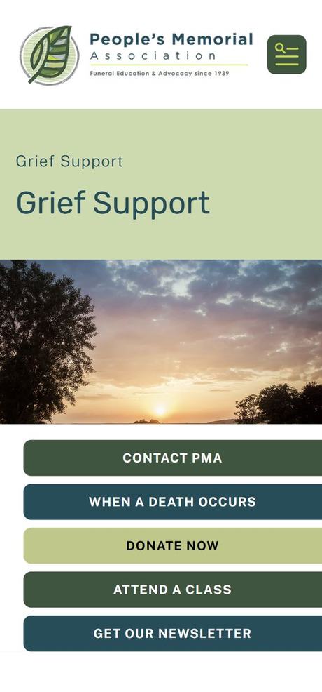

On every page measured, the first sentence of actual writing starts between 968 and 1,120 pixels down the page — one and a quarter to one and a half phone screens. A visitor scrolls past a full screen of logo, coloured banner and heading before the site tells them anything.
The page title, displayed twice
On Grief Support the words "Grief Support" appear twice in a row: once as a small label, then again as the heading, one under the other. Five pages do this word for word.
On the other 184 pages the small label is just the section name: "About PMA" sitting above "Contact Us". It repeats what the menu already said. It costs about a hundred pixels of the only screen most people will see. It should go. If a visitor needs to know where they are, the heading and the menu already say so.
The five buttons
The block of buttons under the picture is set 30 pixels in from the left and 0 pixels in from the right. They are not overflowing; they stop exactly at the screen edge. But they are visibly off-centre. On a screen this narrow, nobody reads that as a design choice. They read it as a site that is broken — on the page where they were about to trust you with a funeral.
They also carry three different fills across five buttons, in a repeating pattern that means nothing:
- Dark green, white text: Contact PMA, Attend A Class.
- Teal, white text: When A Death Occurs, Get Our Newsletter.
- Pale green, black text: Donate Now.
The colour alternates down the stack rather than marking anything out. So the button for the person whose parent has just died carries exactly the same weight as the newsletter sign-up, and the faintest button on the screen is the one asking for money. One colour for the one action that matters on the page, something quieter for the rest. At the moment the colour is doing no work at all.
The footer is a third of the page
The footer is 1,292 pixels tall on every page. A phone screen, once Chrome's address bar and the system navigation bar are subtracted, is about 780. So the footer alone is roughly one and two-thirds of a screen — you scroll it twice to get to the bottom.
As a share of each page: 23% of the homepage, 29% of Grief Support, and 36% of the donate page. More than a third of that page is footer.
What is in it: 21 links and 49 words. It repeats "When Death Occurs", "Become a Member", "PMA Member Benefits" and "Partner Funeral Homes" — all four of which are already in the menu at the top — then four social icons, then the two policy links. On a phone it is stacked one item per line at the same 20-pixel body size as the content, which is why it runs so long. A footer of the address, the phone number, three links and the policies would be a quarter of the height and lose nothing.
7How long the site takes to load
This can be measured rather than argued about. I ran Google's own tool, Lighthouse, against the live site on an emulated phone on a normal mobile connection — the same test that sits behind PageSpeed Insights, at version 13.4.1. Scores are out of 100.
The two white gridlines are Google's own bands: 50, and 90.
Red is under 50, amber 50–89, green 90 and above — Google's own bands. Grief Support is here as a control: an ordinary interior page, same platform, same template, same footer.
Dashed line: 3.8 seconds, the line Google itself treats as good.
Lighthouse “time to interactive” on an emulated phone. 3.8 seconds is the line Google itself treats as good.
Dashed line: 1.6 MB, Google's pass mark for an entire page.
The third bar is this same homepage with its photographs served at the smaller sizes Firespring has already generated and already stores. No new files, no new software.
Read the accessibility and search rows first, because they are good: 95 and 92, with a perfect 100 for search on the interior page. Whatever else is wrong, the site is not invisible to Google and it is not hostile to screen readers.
Now the row that matters. The homepage takes 63.7 seconds to become usable on a phone. Not 6.3 — sixty-three. That is a minute of half-drawn screen before a tap does anything. Nobody waits a minute. Whatever the homepage was written to accomplish, on a phone it does not get the chance to try.
The cause is not the server and it is not the writing. It is weight, and weight is the most fixable category of problem there is.
Where the 12.7 megabytes comes from
10.0 MB photographs · 79% 1.4 MB JavaScript · 11% 1.2 MB fonts, stylesheets, the page itself · 9%
80 requests in total. 31 of them are photographs.
Four fifths of the homepage is photographs. The largest single file is 4.6 MB and 5,472 by 3,648 pixels — a camera original, uploaded as it came off the card and never resized. Two more are over 2 MB each.
The smaller copies already exist. Firespring stores each of these photographs at 600, 1,200 and 1,600 pixels wide as well as at full size, and the page offers all four to the browser. What the page never says is how much of the screen the picture will fill. Without that, the browser has to assume it fills the whole width and picks defensively — the largest file it can justify.
Served at the 1,200-pixel copies that are already sitting on the server, the seven photographs on the homepage come to 1.4 MB instead of 14.8 MB. That is a 90% saving for no new files and no new software. It is one missing attribute per image, in a template PMA does not control.
Whose homepage is it
11.1 MB Firespring · 88% · 31 requests 1.2 MB Google · 10% · 38 requests 0.3 MB Facebook, search, monitoring · 2% · 10 21 KB peoplesmemorial.org · 0.2% · 1 request
Every request the homepage makes, grouped by the company that answers it.
PMA's own server accounts for one fifth of one percent of PMA's own homepage. It sends the HTML — 21 kilobytes, in 250 milliseconds — and everything after that comes from somewhere else. Firespring's CDN sends 11.1 megabytes across 31 requests. Google sends 38 more: Maps, Tag Manager, Fonts, Analytics. Then Facebook's tracking pixel, a hosted search box, and an error-monitoring agent. Most of that list was never a decision anyone at PMA made. It arrives with the platform.
The 1.4 MB of code, against something an invoice can be compared to
Here is the number that puts it in scale. Google's pass mark for an entire page — text, code, photographs, everything — is 1.6 MB. This homepage spends 1.4 MB of that on JavaScript alone, before a single photograph, and then downloads ten megabytes of photographs on top.
What the 1.4 MB is made of: 27 separate files, including jQuery 3.3.1 — released in 2018 and superseded twice since — a 396-kilobyte bundle of Firespring platform scripts, a slideshow library with its own animation engine at 107 KB between them, and the full Google Maps API on the homepage, 450 kilobytes to draw one map. Alongside it, two stylesheets totalling 732 KB, one of which is 477 KB and holds 2,151 style rules for a design that uses a small fraction of them. And 382 KB of fonts, 157 KB of that a single icon font whose job is four social media logos.
None of this was written for peoplesmemorial.org. It is a platform's entire toolbox, shipped identically to every customer, and the customer pays for it in seconds. The modern way of building a site of this size does the opposite: the tools work out which rules and which functions a page actually uses and throw the rest away before it is ever sent. Run that over this design and the 477-kilobyte stylesheet becomes tens of kilobytes, and most of the 1.4 MB of JavaScript stops existing, because almost nothing on these pages needs it. A site of 153 mostly-text pages, built today, is a few hundred kilobytes and no framework at all — inside Google's 1.6 MB pass mark with the photographs still to come.
That is not a hypothetical, and the comparison does not need a stranger's website. This report is a web page built the modern way, and Google Lighthouse was run against it on the same emulated phone, with the same settings, as every figure in this section: 98 out of 100, 0.6 MB, 9 requests, usable 2.0 seconds after it is opened. It carries three photographs of the site, and it is one twenty-first of the weight of the homepage. The homepage scores 33, downloads 12.7 MB across 80 requests, and cannot be tapped for 63.7 seconds. Same test, same phone, same afternoon.
Every page also carries the full text of the privacy policy and terms — 1,221 words — as hidden markup inside a pop-up that only opens if clicked. Nobody reads it and every visitor downloads it. It is a small thing, and it is the same thing: the platform ships everything to everybody.
The consequence is not the download — it is the phone. The browser spends 5.2 seconds of processing working through that JavaScript, of which 1.55 seconds is time the screen is frozen and taps do nothing. Google's threshold for "good" there is 0.2 seconds. On an older phone it is worse, and on an older phone is where a lot of this audience is.
The server itself is fine. It answers in 250 milliseconds. Nothing here is a hosting problem, and nothing here is fixed by paying for a faster server. The page is slow because of what it is made of.
Two things belong on the record. Layout stability is perfect — nothing jumps around while loading, which is a genuine and common failure this site does not have. And the interior pages score 56, not 33: the homepage is dragged down by its photographs specifically. The worst page on the site is also the cheapest one to fix.
But note what the control page proves. Grief Support carries no camera originals at all, and it still takes 12.5 seconds and 2.6 MB. Fixing the photographs takes the homepage from unusable to slow. The floor underneath it — the 1.4 MB of code, the 82-item menu, the 1,292-pixel footer on every page — is the platform, and it does not move without moving off the platform. That is section 8.
8Firespring, and what it would take to leave
The site runs on Firespring, a bundled platform sold to non-profits: it supplies the hosting, the page editor, the menu, the forms and the file storage as one package. Everything in this report — the 82-item menu, the 65 URLs generated automatically, the 20-pixel type that has no phone size, the 477-kilobyte stylesheet, the tagline welded into a picture, and 88% of the weight of the homepage — is downstream of decisions that platform made, not decisions PMA made.
What the platform does with a page
Here is one page photographed end to end on a phone: the member page listing the two pet funeral homes that give members a discount. The whole page is on the left at true proportions. The bars on the right say where its height goes.

peoplesmemorial.org/member-hub/contracted-providers/contracted-pet-funeral-home.html, captured at 412 points wide — a Galaxy S22 Ultra — and measured in the browser. Total height 2,571 pixels: 2.9 phone screens.
The header is doubled. A white logo bar, then a green band carrying the page title twice — "Contracted Providers" above "Contracted Pet Funeral Homes" — then a stock photograph. Then the same five buttons that sit on all 199 pages: Contact PMA, When A Death Occurs, Donate Now, Attend A Class, Get Our Newsletter. A member is 875 pixels down — one entire screen — before anything on this page is about pet funeral homes.
Then the page arrives, and it is 24 words. One sentence saying members get 15% off, and two business names. That is the whole reason the page exists, and it is correct and well written. It occupies 16% of the page height.
Then 1,292 pixels of footer — the same footer measured in section 6, which is a fixed height on every page. Here it is half the document. Counted in words: 24 belong to this page, 1,355 belong to the footer, and another 442 to the menu. The footer is fifty-six times longer than the page it sits under.
There is no technical reason this is not one screen. Logo, title, the sentence, the two providers — about 600 pixels, no scrolling at all on any phone made in the last ten years. Every pixel above and below that was placed by the template, on every page, whether the page needs it or not. This is what "the platform decides" means in practice, and it is the same on all 153 pages.
So the question is what it would take to leave. Less than it looks — and the reason is that the two hardest pieces have already left.
The hard parts are already somewhere else
The two functions that are genuinely difficult to move off any platform are taking money and sending email. Neither of them is on Firespring now.
- Donations already run through Little Green Light. The donation forms are embedded from
secure.lglforms.comon 13 pages, including the main Donate page. Firespring is hosting the page around the form; it is not processing the gift. - The newsletter already runs through Constant Contact. Its code appears on the sign-up page and the news pages, loading from
static.ctctcdn.com.
So what Firespring is actually providing is the page editor, the menu, eleven forms, the member area, and a place to keep 65 PDFs. That is a much smaller thing than "the website".
What a move would involve
- The pages. 153 real pages of writing. They already exist as text; this report was produced from a complete byte-for-byte copy of all 181 URLs, which is the migration source material and is already on disk.
- The URLs. Every one of the 181 old URLs, plus the 17 short ones like
/joinand/donate, has to keep working — a forwarding table. That table is the single most important artefact of a move, and section 1 of this report is the first draft of it. - The files. 65 PDFs, currently at URLs like
/file_download/<long code>. They move as files, and the forwarding table covers the old links. Section 9 is the inventory, and it has three problems in it worth fixing before anything moves. - The forms. Eleven of them — contact, membership application, volunteer, speaker request, job enquiry, document scanning, contact update. Each becomes a form that emails staff and files the response. This is the ordinary work of the move, not the risky part.
- The member area. This is the real question, and the one that needs a conversation rather than a paragraph: what members can currently see and do when logged in, and where that lives afterwards.
What changes for the better
Cost. A site of this size, served as plain pages, costs a few dollars a month to host — in some cases nothing. Every remaining piece is a commodity service bought separately, kept or dropped on its own merits. I cannot tell you the saving without seeing the current invoice, and that is the first number to put on the table.
Control. Right now a type size, a logo, a menu depth and a URL shape are all things that have to be worked around. Afterwards they are one-line changes. The reorganisation proposed in section 1 is straightforward on your own pages and awkward on this platform, and that is not a coincidence.
Email. Constant Contact does the job it is doing. The open question is whether the newsletter should ever be more than a monthly send. A sequence for someone who downloads a planning document. A different note to a member in their renewal month. A follow-up after a class. That is what a marketing automation tool such as ActiveCampaign does, and at your list size it is cheap. Formatted HTML email can be generated from the same source the site pages are built from, so the newsletter stops being hand-assembled every month.
Speed. Most of section 7 stops being a project and starts being the default. Plain pages with correctly sized images and no framework will load in a second or two on a phone rather than sixty, without anyone having to maintain that.
The honest risk. A migration is real work and it has one way to go badly: old links breaking. Everything else — forms, files, layout — is recoverable. Links are not, because they are printed on paper, sitting in other people's emails, and indexed by Google. The forwarding table is the deliverable that determines whether the move is invisible to visitors or a disaster, and it should be signed off before anything is switched over.
9The 65 PDFs
Not 200. Sixty-five PDF files are stored on peoplesmemorial.org, and every one of them is reachable by following links from the homepage. They weigh 152 megabytes — 44% of everything the site is made of. Seven more PDFs are linked but live on other organisations' sites; those are somebody else's files, and two of the seven have already gone.
Here is all 65, grouped by what they are:
Sixteen financial documents on one page are 85% of everything PMA stores.
| 16 | Annual reports and Form 990s — 128.8 MB. All sixteen hang off one page, /aboutpma/financials-for-transparency.html. This is 85% of the total weight. |
| 23 | Planning forms members download — 7.2 MB. Ducks in a Row, Designated Agent, Disposition Authorization, Document Storage, plus the Spanish and Chinese versions. |
| 8 | Funeral home price surveys — 2.4 MB. The 2024 survey, split by county, plus 2022 and 2016. |
| 5 | Board minutes and governance — 0.8 MB. Annual meeting minutes, 2021 through 2024. |
| 3 | Advocacy letters and filings — 3.2 MB. Two letters dated September 2025, and one FTC report. |
| 2 | Annual meeting slides — 4.6 MB. |
| 2 | Financial assistance — 0.8 MB. The Funeral Fund guidelines and application, stored twice. |
| 2 | Consumer leaflets — 0.3 MB. Recognising funeral scams; scattering ashes. |
| 4 | Everything else — 4.3 MB. |
Why nobody can tell what these files are
Firespring stores every file at a URL like /file_download/b39fcd39-6892-4331-92e4-8a4ca3164ee6. The URL contains no filename — not the year, not the document type, nothing. The only name a file has anywhere on the site is the words somebody typed into the link. So four separate documents are called "read the minutes", three are called "review the slides", and the same checklist is called "Ducks in a Row Checklist" on one page and "Download the Ducks in a Row Checklist" on another. Nobody can audit a library they cannot read the names of, which is how the next two problems happened.
Nine documents are stored more than once
There are 65 files but only 54 distinct documents. Nine of them exist at two or three different URLs — 20 copies of nine documents. The 2025 Annual Report is stored twice at 17.4 MB each, once for the homepage banner and once for the transparency page. The Document Storage Form is stored three times. Deleting the extra copies changes nothing a visitor sees.
The one that actually matters: forms that disagree
Duplicates are untidy. This is different. Several different versions of the same legal form are live at the same time, and which one a member gets depends on which page they clicked from.
- Ducks in a Row Checklist — three different English files. 456,583 bytes from
/education/ducks.html; 456,410 bytes from/education/planning-information; 350,773 bytes from the Member Hub. Two of them are labelled with exactly the same words — "Ducks in a Row Checklist" points at the 456,583-byte file on one page and the 456,410-byte file on another. And the Member Hub forms page offers two of the three itself, one under "Download Ducks in a Row Checklist" and the other under "Download the Ducks in a Row Checklist". - Designated Agent Form — three different files, and two of them are linked from the same page.
/member-hub/planning-documents/offers a 635,087-byte version and a 218,307-byte version; the FAQ page and the planning pages offer a third at 236,103 bytes.
A Designated Agent form names the person legally entitled to direct someone's remains. If those versions differ in any material way — a field, a witness line, a phrase — PMA cannot say which one is in a member's file. The answer depends on which link that member clicked, years ago. This is the only item in this report that is a paperwork risk rather than a marketing one.
Six spelling errors in the documents themselves
Every PDF that has a text layer was read word by word against a dictionary. Sixty of the 65 could be read that way; five are scans of paper with no text in them, so they were not checked. Six errors are real, and four of them sit in the documents PMA hands to the public.
- "advocay" for "advocacy" — in the donation line at the foot of the 2024 price survey: "To support transparency and consumer advocay work, like this price survey, consider donating to PMA." It is in five files — the full survey and the King, Pierce, Snohomish and Spokane county editions — all offered from the price survey page. It is the sentence that asks for money, in the document PMA is best known for.
- "guarenteed" for "guaranteed" — the headline of the Complete Funeral Home Price List: "Prices guarenteed July 1, 2026 – June 30, 2027." That is the line a member reads to know the price will hold.
- "cermony" for "ceremony" — the footnote on the same price list: "'Direct' refers to no laying in or cermony service included." That file is linked from six pages, including four of the member benefit pages.
- "satsified" for "satisfied" — in the 2024 Annual Report: "98% of people shared that they were satsified with the selection and quality of goods and services offered." The same paragraph spells "satisfaction" and "satisfied" correctly, so this is a slip, not a habit. It is on the page that asks donors to trust PMA with money.
- "Órden médica" for "Orden médica" — the first section heading of the Spanish Ducks in a Row checklist. In Spanish the singular takes no accent; only the plural does.
- "Lista do asuntos funerarios" for "de" — this one is on the site rather than in a file. It is the link label on the Spanish member forms page, and "do" is Portuguese. One occurrence.
None of the four English errors appears anywhere in the site's own pages, so fixing them means re-saving the PDFs, not editing the site. Everything else came back clean: the Designated Agent forms, the Disposition Authorization, the Document Storage form, the financial assistance guidelines, the prepayment and scattering guides, the scam warning sheet, the board minutes, the legislative letters, and the 2018 through 2023 annual reports. The five files with no text layer — the 2024, 2023 and 2022 Form 990s, the 2020 price survey and the letter to state agencies — could not be checked this way, and neither could the two Chinese documents.
What to do about the files
Half a day of work, and none of it waits on the platform decision.
- Open the three Ducks in a Row files and the three Designated Agent files side by side, decide which is current, and retire the rest.
- Give every remaining document one name, and link that one URL from every page that mentions it.
- Correct the six spelling errors. Five of them are one word in one sentence of three PDFs; the sixth is a link label on the Spanish forms page. The price survey correction has to be made in five files.
- Shrink the financial documents. The 16 of them are 128.8 MB on a single page, and the 2025 Annual Report alone is 17.4 MB — a five-minute download on a phone. Re-saving a print-resolution PDF at screen resolution usually takes 80 to 90% off with no visible change. This is the page people open when they are deciding whether to trust PMA with money.
10Things that are simply broken
There are 312 content problems on the site. Twenty-two of them are live faults a visitor can hit today. These are the ones that matter:
A 2024 document, filed in the 2025 row, marked "coming soon"
The transparency page carries a line reading "2025 Annual Report and 2024 Tax Form 990 (coming soon)". Two different years are joined by an "and" on a row headed by the newer one, so the first thing a reader has to work out is which year they are looking at.
Then the label is wrong about both. The 2025 Annual Report is on that very line as a live download, and the top of the same page announces it — "NEW! Read the 2025 PMA Annual Report here!" The 2024 Form 990 is on the line directly underneath, also live. The same 990 is therefore listed twice on one page, once as delivered and once as pending.
The work was done and the label was never taken off. The one page whose job is to show PMA is on top of its paperwork has a row saying the newest documents have not arrived. A stranger checking up on a charity reads that line and stops there. Split the two years onto their own rows and delete two words.
Links that open a new tab when they should not
This is not a one-off. 103 different links to other pages of peoplesmemorial.org are set to open a new browser tab, and they appear 420 times across the site.
The worst case is the "Contact PMA" tile in the quick-links strip: it appears on all 199 pages, and every one of them opens a new tab. (The "Contact Us" item in the main menu behaves correctly — it is only the tile.) Beyond that, 73 pages have at least one more in their body text: "Take me to planning documents" on 10 pages, "Webinar Library" and "mission and vision of PMA" on 7 each, "Purchase Digital Document Storage" on 5.
Why it matters more than it sounds:
- It takes away the back button — the one control every visitor knows. In the new tab, Back is greyed out. There is no way back to what they were reading except closing the tab, which many people do not think to do.
- On a phone it is worse. Tabs are hidden behind a small numbered square. A visitor reading the planning-documents page who taps three links now has four tabs and no sense of where they came from, and no reason to think the site did it to them.
- It is a decision taken away from the reader. Anyone who wants a new tab can already ask for one — middle-click, long-press, ctrl-click. A page that forces it is overriding a choice the visitor had already made.
- Screen-reader users get no warning. The focus moves to a new document with no announcement, which is a recognised accessibility failure.
What should keep it: downloads and outside websites. 26 links to your own PDFs open in a tab: the price surveys, the Designated Agent form, the Ducks in a Row checklist. That is the right call. A download that replaces the page someone is reading is its own kind of rude. 178 links to other organisations do too, which is a matter of taste rather than an error. The fix is narrow: remove target="_blank" from links that point at peoplesmemorial.org pages, and leave it on files and on other people's sites. In Firespring that is an edit to the link settings, mostly in one shared quick-links block plus about seventy body links. Every one of the 103 is listed by page in the full report.
- 14 internal links lead to an error page. The worst is
/member-hub/forms.html, broken on seven pages. - Your "email us" links are broken by the anti-spam trick that hides them. The email addresses are written in a scrambled code so that spam robots cannot read them — but the website software then treats the scrambled code as a page name. Two of these links serve an error page instead of opening a mail window. A third, on the plot-donation page, is a plain email address used as a page name with the same result.
- 30 links to other organisations' websites now lead to pages that no longer exist — including the Washington Department of Health, Five Wishes, End of Life Washington, and a training provider whose pages are linked 17 times.
- Real typos, including "inturment" (one paragraph away from a correctly spelled "inurnment"), "emblaming", "premesis", "industy", and "Estate Taxes Made Easy withTiffany Gorton" with the space missing.
- Repeated words: "PMA and and its allies", "education has has been".
- Four buttons go nowhere, including "View the FFA Guidelines & Application".
- 111 pages share their title with at least one other page — 24 pages are all called "Professional development for death care and funeral professionals" — and 70 URLs serve text identical to some other URL's, in 26 groups. Both push your pages down in search results.
- Spanish and Chinese are one page each, reachable only from the menu, marked in the site's code as English, and containing broken links. They read as an afterthought rather than a language option.
11What is good and should not be touched
The education section is the best-written part of the site. "What are my choices?", "Who are my legal next of kin?" and "Should I prepay?" are clear, honest and written for the reader. The FAQ answers have real voice — "No. And you don't need a reservation!" and "Members are not charged extra if you die at home or outside of business hours". The price tables are exactly what a consumer advocate should publish. The Advocacy Wins list is a genuine record of seven changes to Washington law and needs nothing but to be made visible.
This is the inventory of what PMA already owns and is not spending. None of the recommendations in this report involve rewriting any of it. They involve moving about nine sentences that already exist to the tops of the pages where a decision gets made.
12What to do first
In order. The first six are about four days of work in total, they need no decision about the platform, and between them they change what every visitor on a phone sees.
- Publish the annual report and the 990, or change the sentence.
An afternoon. It is the transparency page.
- Fix the 14 broken internal links and the scrambled email links.
A day. People are hitting error pages today, including on "email us".
- Stop your own pages opening in new tabs. Start with the "Contact PMA" quick-link, which does it on all 199 pages.
Half a day. One shared block plus about seventy body links; leave PDFs and outside sites alone.
- Set a phone size for body text, and take the tagline out of the logo image. The type rule is one line of CSS; the tagline becomes real text beside the wordmark, or is hidden on small screens.
A day. Changes how every page reads on a phone.
- Resize the photographs, starting with the homepage. Four images account for 10 megabytes. Tell the pages how much of the screen each picture fills, so the smaller copies that already exist actually get used.
A day. Takes the homepage from 12.7 MB to under 3.
- Cut the footer and centre the button block. The footer is a third of the donate page; the buttons sit 30 pixels from the left edge and 0 from the right.
Half a day. Gives back a screen and a half on every page.
- Put "Someone has died" in the header on every page, with the phone number on the page's first screen.
A day, no reorganisation required. Highest human value on this list.
- Rewrite the homepage's first screen and change "Submit" to "Join for $99".
A week. Uses only facts already on the site.
- Settle the numbers: one membership figure, one partner-network figure, and fix the $50 preview text on the join page.
An afternoon.
- Merge the four auto-generated sections into one page each. Staff bios, Deathcare Professionals, Speakers Bureau, Planning Information.
Two weeks. Removes 52 pages without losing a word of content.
- Then the reorganisation, section 1. The full forwarding table gets written before anything moves.
A project. Do not start it before the homepage rewrite, and do not start it without the forwarding list.
- Separately, put a number on what Firespring costs. Donations and email are already on other services, so what is being paid for is the editor, eleven forms, the member area and file storage. That is the figure the migration decision turns on.
One meeting and one invoice.
13How this was done
Every page, image, document, stylesheet and font on peoplesmemorial.org was downloaded exactly as the site served it — 287 URLs, 722 files, 348 megabytes, including 436 images and 70 PDFs, 65 of them PMA's own. All 444,158 words were extracted into a single file, with the repeated menu and footer text labelled so it could be separated from real page content. The numbers in this review were then counted from that copy rather than estimated by looking at the site.
The speed figures in section 7 come from Google Lighthouse 13.4.1, run against the live site on an emulated phone. The screenshots in section 6 are captures of the live site at 412 points wide — a Galaxy S22 Ultra. Every dimension was measured in the browser, not eyeballed.
Nothing was changed on the live site, and nothing was rebuilt. This is a measurement, and the full technical record — including every error with the sentence it appears in and every page it affects — sits behind it.